
This section provides examples of where my work was able to significantly change how Ford did its business in Human Machine Interface (HMI) or where it contributed to Ford Motor Company significantly impacting Automotive Industry UX. This is in chronological order, so the most recent examples are down further in the post.
Since the mid 2000s, I have been the UX specialist at Ford Motor Company that has been charged with leading change in their Human Machine Interface (HMI).
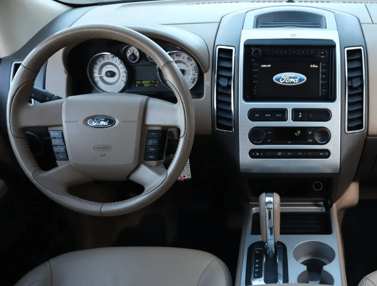
This started with building compelling strategic business cases to support a move from DIN radios that were not sympathetic to the design of the rest of the interior.


Learning from a Standout Success
With the success of Ford’s first generation of SYNC, I was selected to be part of a small team to develop the evolution of that product. This was a fantastic project that Ford had contracted with IDEO to lead. On this project, as well as the Smartgauge project for the 2010 Ford Fusion Hybrid instrument cluster, also led by IDEO, I learned much of what would become the foundation of my work going forward, from research methods to data synthesis to ideating on how to solve for the needs of our customers. The output of this project was what we called MyFord Touch, which, while well-intentioned, was unfortunately, a flawed product. Its flaws are well documented; however, from a change perspective, the HMI in Ford vehicles would never be the same, as this product -at its core – acknowledged that customers were looking to be more connected to their lives outside of their car. My interaction concept was to eliminate the typical status information bar and, instead, add status information to the domain launch buttons, themselves. On top of this, we would locate the domains in the corners to ease both finding and actuating the button with the tactile support afforded from the surrounding bezel. Ford chose to go forward with the ‘4 corners concept’ and it was granted a design patent, as it was unlike anything else in the industry. The uniqueness of this design was so identifiable that it was also featured as a ‘frame’ for the telestrator on the NFL on Fox pregame show!
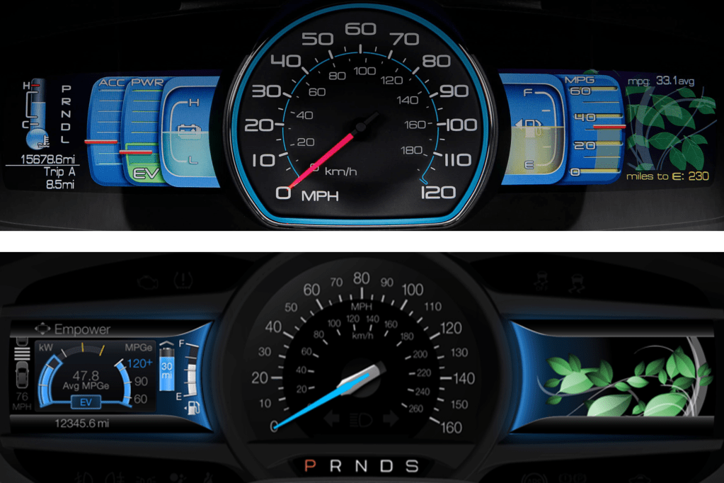
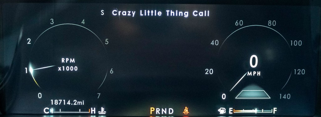
We also introduced another significant change to the industry with an instrument cluster that acknowledged the increased desire for connectivity. Uniquely, our instrument cluster provided as much space to infotainment content as it provided for vehicle status, with dedicated displays for each flanking the speedometer. On the steering wheel, we provided unparalleled functionality to the driver through controls dedicated to managing the two displays in the instrument cluster. Introduced at the 2009 Consumer Electronics Show in Las Vegas, it was an influential shot across the bow of the industry.

Throughout this project, I was seen as the driving influence in HMI at Ford Motor Company. My assignment was to lead the evolution of the breakthrough Smartgauge instrument cluster from the 2010 Ford Fusion Hybrid to accomplish two things: support showroom consistency with the MyFord Touch instrument clusters and to make the HMI in electrified vehicles more accessible to a growing customer base that was embracing changes in powertrain offerings.
Change Sometimes Brings Lessons Hard Learnt
While working on the second generation of Smartgauge, issues with MyFord Touch began to surface. Among the critical reliability and responsiveness concerns that surfaced, there were usability issues as well. A crucial learning here was that while MyFord Touch delivered a lot of what customers wanted, we did not do enough validation of our concepts to ensure that the priority of their desires was managed well enough to keep the interactions simple and quick. We tried to give them everything!
In order not to repeat the stumbles with MyFord Touch, Ford Motor Company hired Parrish Hanna to lead the Global HMI team. He ushered in a cultural transformation that doubled down on touchpoints with customers to create and deliver products that better met their needs. Under his leadership, many improvements were introduced for MyFord Touch. At the end of its run, MyFord Touch enjoyed industry leading quality, which carried forward in the tremendous launch of its successor, Sync 3.
Establishing New Markets
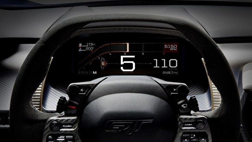
Since my role was about change, either developing HMI to make new technologies accessible or changing the way Ford delivered HMI to better take advantage of new technologies, I was not involved in the ongoing product development of MyFord Touch or its evolution to Sync 3. Instead, I was tapped to lead the development of the HMI for the renaissance of the 2016 Ford GT and the 2017 Lincoln Continental, which featured Ford Motor Company’s first fully digital instrument clusters and, on the Continental, their first ever Head Up Display. While these products did not have the industry scope of Sync 3, they both represented very visible investment in markets that were very important to Ford: returning Ford to success at Le Mans to honor the legacy of one of motorsport’s greatest successes and returning a somnolent Lincoln brand to the status it rightfully enjoyed as an esteemed luxury marque. Both of these products enjoyed successful launches regarding their HMI as they, too, benefited from a culture that embraced a better understanding of the customer’s goals to inform our work.

Updating the Entire Portfolio
It is a very easy thing to assume that since we are also customers of these products, our drive to address the issues that bother us are representative of the concerns of the general marketplace. This assumption is flawed due to our higher than average education and our unique immersion in the automotive world. While some would argue that some ultra-successful customer electronics companies don’t do as many customer touchpoints as we do, the point is simply irrelevant because those companies do not have to be held to the same standard as automotive UX: when a customer interacts with those products, their focus is on the product; using the product is paramount and mistakes have few consequences. In automotive UX, when the customer interacts with the HMI, their focus is typically on something else; driving well is paramount and mistakes can be catastrophic.
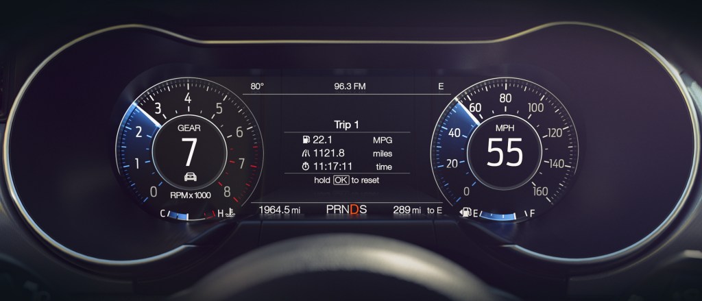
With the success of the fully digital clusters in the Continental and Ford GT, I was assigned to translate the foundations of those two very disparate clusters to a common structure that could convincingly be used across the varied portfolio from Fiesta to F-series. These new fully digital clusters would have to improve on the experience of instrument clusters in our most iconic vehicles, like the double-barreled instrument cluster of Mustang.
To develop a strategy that would support the breadth of the portfolio, I had to work with Marketing to understand the needs of the various product segments, with Vehicle Engineering team to understand the vehicle dynamics differences associated with the different drive mode offerings (to better suit different driving contexts, like slippery roads, off-roading, eco-driving, etc.) and with Design to understand the flexibility of how they wanted to present the information across the breadth of vehicle programs. I developed a modular strategy with fixed foundational content across all modes, conditionally fixed additional content within each mode and tunable, or opt-in content, that could be visible in any mode and shepherded it through the escalation of various approvals. This general structure launched in 2018 with the Mustang and Navigator and is seen in most Ford Motor Company vehicles today.
A New UX for a Revolutionary New Mustang
The earliest days of the Mustang Mach-E were trying times. Ford wanted to make a more deliberate step into the tenuously growing market of electric vehicles than it had with the Focus Electric, but it was having a difficult time managing the tensions of the heavy investment and its culture of managing corporate CAFE standards to support its most important nameplates, the F-Series. In practice, this meant that the deep passion it had for understanding and serving the F-Series customer was typically not repeated for smaller cars that weren’t as integral to the identity of Ford Motor Company. This meant that the initial incarnation of the all-new c-sized electric vehicle was being developed as a “compliance car” – something that would achieve its goals of energy efficiency, but without much investment in establishing a passionate customer base. To their credit, the most senior management at Ford realized the futility of this exercise and directed a prophetic change in direction. They were going to develop an all-new c-sized electric vehicle specifically targeted at a passionate customer base and one that would deliberately become integral to the identity of Ford Motor Company: a Mustang EV!
To avoid the gravitational pull toward corporately conservative product development, a skunkworks team of change agents were isolated off-campus and given license to create history the future. I was part of this team to usher in a new user experience for this revolutionary new Mustang.
Because this was a Mustang, the silhouette and proportions of the vehicle were very important to identify this vehicle as a Mustang, even though it was an EV and a Sport Utility. On the interior, it was important to maintain the tradition of a dual cowl instrument panel, or dashboard, but there was a strong desire to simplify and modernize the gesture of the dashboard and a very deliberate direction to eliminate switchgear and focus the interactions to the touchscreen, as Tesla had done. Since in an EV there is generally less information for a driver to keep track of, it was decided that we would employ a small instrument cluster, with a very simple interface to prioritize Speed and Range to counterbalance the large touchscreen that would dominate the interior.

To better support the driver’s confidence as they transition to an EV (potentially from a visceral Mustang GT), I worked to simplify the switches on the steering wheel to better suit the simple instrument cluster with which they interfaced. This was also done in acknowledgement that a large, bright touchscreen was likely going to invite interactions there. We were limited to an existing corporate switch, so a real development into switches to optimally support confident interaction was impossible, but we reduced the clutter of switches on the steering wheel. I had lobbied to locate the instrument cluster higher in the driver’s gaze, viewable above rather than though the steering wheel in another effort to support confidence by keeping eyes up and out. Unfortunately, this was not possible, as this would have required a new steering wheel, which is a very expensive and time-consuming development, given the criticality of understanding the myriad safety implications of a steering wheel to a driver’s body in the event of an accident. While I was not able to get all of what I was after, I was happy to have created a simple, deliberate Steering Wheel / Instrument Cluster interface.
In the touchscreen, our team developed the Dash Card interface, which received a design patent. The heart of the Dash Card interface was in eschewing the traditional static domain launchers for Navigation, Audio and Phone for dynamic Dash Cards that would reflect a driver’s most recent application selections in the touchscreen. If the driver’s application selections were traditional, then the typical domains of Navigation, Audio and Phone would be present as Dash Cards that would launch the app when touched. If, however, the driver’s application selections weren’t typical (perhaps they were accessing a new suite of apps being developed or checking in more frequently on their energy consumption as they got up to speed with the intricacies of a new powertrain), those apps would be displayed in their set of Dash Cards, representing their recent interests and facilitating a quick and easy switch between the apps that satisfied their curiosities of the moment.
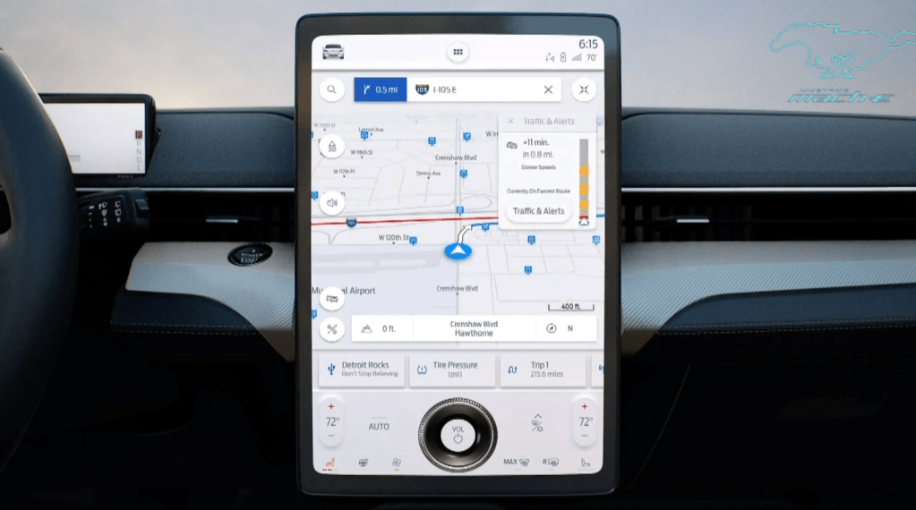
The Mustang Mach-E launched to much acclaim and is generally regarded as a success. There were several constraints that we had to manage to best support the interactions of the driver and passengers, from package and hardware decisions to support the importance of an exterior silhouette, to corporate decisions to be like Tesla, to a comparatively short timeline for the program – all of which had pros and cons. Perhaps my favorite critique of the Mustang Mach-E was in a comparison to Tesla’s Model Y, done by BBC’s Top Gear, in January 2021:
“If you like your tech on the bleeding edge and your furniture minimal, the Y is your choice. But if you just want to drive an electric car that keeps you safe and doesn’t try to dazzle you, the Mach-E is on point. It’s the less demanding, easier to interact with car.”
This critique is a favorite of mine because it coincides with the next seismic event in formulating my point of view on how to provide a confident and rewarding in-vehicle user experience.
Fundamentally Changing Interior Architecture Through Understanding Customer Goals for In-Vehicle Interactions
As my work on the Mustang Mach-E UX began to subside, I had an opportunity to consider the insights and tensions I had witnessed in content that was pushed or pulled by customer needs and business needs across the span of markets I had the opportunity to immerse myself in over the prior few years of work. I was able to go deep in luxury, performance, and electrified vehicles, and in the cross-carline work on drive modes. I had access to insights on the Trucks and SUVs that millions drive daily. In each individual project, one is driven to provide answers for that project, but from a higher-level view across the different projects, a single question surfaced: How might we optimize interactions in our vehicles to better support the goals of customers across the globe? Are there patterns out there that might better inform the What, Where and How we stage interactions for our customers?
In late 2018 and for the duration of 2019, I led a global research effort to better understand customer goals for in-vehicle interactions. Together with my colleague, Curtis To, who had consolidated hundreds of customer research papers into a framework of human goals, we created a variety of conceptual provocations that probed on how to satisfy those goals through variations in the interactions with controls, displays and content distributed across the instrument panel and on their brought-in devices. The variety of provocations were configured into four unique interaction architectures. We interviewed hundreds of drivers, together with first-row passengers that they often traveled with, on their thoughts of interacting with these provocations during simulated driving journeys. We were able to look at comparisons both within and between subjects across the variety of interaction concepts and, without giving too much away, we did find patterns across the globe. We were gratified to see that what we had learned from our research on interactions in the vehicle was consistent with research that explored how people live with technology in their world outside the vehicle. This surfaces a tension in the desire to have seemingly unlimited connectivity with the rest of their world and the capacity to manage those connections with the demands of the moment – leading to distraction and anxiety. It also points to a gap in how the design of in-vehicle interactions are challenged to be completed within the budget of available attention, undermining confidence behind the wheel. I appreciate the Top Gear characterization of the Mach-E being a car that is ‘easier to interact with’ and see that as a step in the right direction, and wonder how much more could have been accomplished?
We distilled our research into a few distinct insights and tensions that informed three high-level interaction principles. Our research findings were very well received and became a core input to Ford’s updated display strategy. This has led to significant and very visible changes in the cockpit display configurations that will be coming to market in the next year, or so.
Interaction Principles and Interaction DNA
As a result of the response to the research, I was asked to develop interaction principles to provide guidance to the HMI team and to establish more consistency in the interactions being developed at Ford. We called this an interaction DNA. During the regular course of business, ideas from other industries or from competitors are often discussed as good ideas to consider… or duplicate. When these ideas are raised by senior managers, the pressure to respond quickly tends to tilt the scale toward duplication, albeit with cosmetic updates. This process necessarily takes the customer out of the picture as the ‘what’ to duplicate is seldom accompanied by an understanding of ‘why’ the solution was developed in the first place – let alone whether it is a good fit for the Brand. This, of course, is the wrong way around. If you have a compelling ‘why’, given enough time, it is a rather straightforward process to develop a compelling ‘what’ or suite of ‘whats’ that have a unifying thread in their ‘why.’
On the topic of the ‘why’, the importance of aligning a solution to the Brand should not be underestimated. When marketing is effective, it clearly describes why a particular Brand stands tallest among its competitors for the things it represents. If those things are important to a potential customer, it sets expectations – or, creates ‘whys.’ Given that marketing often describes the Brand through aspirational scenes of capability or personal / social fulfilment, the interactions a customer has on their test drive need to confidently assure them that those aspirations are possible, fulfilling the promise and converting on that customer’s potential.
Thus, the interaction principles were developed to jointly support the goals of the user and to support or even celebrate the Brand. In automotive, the user with the most stringent goals is the driver, as their primary responsibility is to support public safety. Because the driver’s attention is on the road, the design of interactions needs to be seen through a lens akin to the Hippocratic Oath: “first, do no harm”. This means that the attention required to complete the interaction must not undermine the attention needed to responsibly drive the vehicle. In practice, this means that the design of interactions must support keeping the driver’s eyes and mind on the road. To guide the global HMI team, I developed 10 interaction principles focused on supporting those two objectives in an automotive context. When the interaction design accounts for these vulnerabilities, the driver is enabled to undertake an interaction to access a desired function with confidence and a feeling of being in charge. In terms of supporting the Brand, Ford’s Brand promise is: To help build a better world, where every person is free to move and pursue their dreams. When we design interactions that result in a confident user experience, there is more mental capacity available to access more of the capability in your F-series, Mustang or Bronco, more richly enjoy the company in your Explorer or Expedition, or simply enjoy the byways you are driving, prepare for the day ahead or simply think about whatever is on your mind. This is how designing a confident user experience does its part to support the freedom to move.
When the interaction design does not keep eyes and mind on the road, in the best case, the driver must pick and choose when to chance an interaction. In the worst case, the attention to drive responsibly is undermined and driving suffers. As of January 2022, NHTSA reported that 94% of serious automobile accidents are the result of human error. Could that statistic be improved through better interaction design?
