This section offers some insight into areas of my expertise, namely UX for Head Up Displays, UX for Electrified Vehicles and Interactions, using an Eco Coach for context.
Head Up Displays
For many, driving is easy. However, as our drives have become more connected with the rest of our lives, so has the feeling that our attention is being taxed behind the wheel. A Head Up Display (HUD), as an example of Assisted Reality, offers an opportunity to display a limited amount of information to help a driver interpret their driving context in a location that makes it easy to inform. However, that same location makes it just as easy to distract, so there needs to be a considerate filter for what content makes it into a HUD. At a fundamental level, the HUD must support the driver’s sense of confidence and in so doing, support the sense of security for the passengers on board.
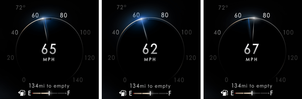
HUD designs often go wrong when they are designed like an instrument cluster – commonly done in the name of consistency. As Emerson said: “A foolish consistency is the hobgoblin of little minds…” and not recognizing the fundamental difference between an instrument cluster and a HUD is where the foolishness sets root. In a cluster, which is a closed-back display, the designer can prescribe the hierarchy of content. Conversely, a HUD is an open-backed display that is projected on the windshield of an automobile. It is open to the environment that the driver is tasked with managing … and hurtling toward. Here, the environment is the star of the show, while the displayed content plays the role of a supporting actor – coming to the fore when the scene requires support and stepping back when none is needed. Acknowledging that the environment is the star is a key attribute for designing a HUD that is a great HUD rather than designing a HUD that is a middling cluster. This means keeping persistent or status info as low or off to the side of the field of view as possible, not exaggerating the size of content to fill the space and not over-designing the assets to attract too much attention. It also means thinking about how to use the natural environment in the staging of content, which isn’t a skill used in cluster design. You sometimes see content displayed in a HUD that was obviously designed for an instrument cluster, or other closed-back display. An example of this might be the avatar of a vehicle providing a reference for information, such as the pitch and roll the vehicle. But this design presents an existential abstraction of one’s vehicle out in front of one’s vehicle. In this case, the result is over-designed content that missed the opportunity to leverage the horizon to deliver simplicity.
The approach that I developed for Lincoln’s Head Up Displays (and most recently, the 2023 Ford Super Duty) is:
- Keep most things quiet, clear and out of the way
- Simplify, by being responsive to the view of the environment, where possible
- Leave yourself some room at the center of the stage to invite the driver’s attention, when needed.
It is a less-pushy means of supporting the relationship.
![[Lincoln Continental HUD]](https://confidentux.com/wp-content/uploads/2022/10/csm_2017-11-14_lincoln-hud_4b3b569387-2.jpg?w=708)


Electrified Vehicle UI / UX
I learned my approach to Electrified Vehicle UX as a supporting member of the team the developed Smartgauge with Eco Guide, the seminal instrument cluster of the 2010 Ford Fusion Hybrid. The focus of that cluster was on research insights that suggested different levels of engagement to enable customers to learn about how their vehicle operated in graduated steps and, ultimately, choose whichever level of engagement felt most comfortable for them. On top of this, there was a desire to provide a stunning design to support the evangelizing of early adopters as they fielded “Why hybrid?” questions from their curious neighbors.

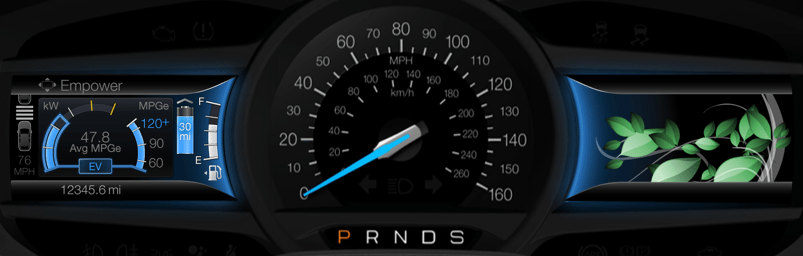
2013 – 2019 Ford Fusion Hybrid and C-Max Hybrid
I then led the UX development of Smartgauge 2. At the time, Ford was marketing MyFord Touch, which compartmentalized vehicle information on a screen to the left of the speedometer and infotainment content displayed on a screen to the right. For showroom consistency, Ford wanted this approach across all of its vehicles. For Smartgauge 2, this meant consolidating all the hybrid operation content to the one screen left of the speedometer – a screen that is about half the area of an iPhone 12 display. This business requirement, plus a Design requirement to present the information with a more traditional gauge appearance, set the brief for Smartgauge 2.
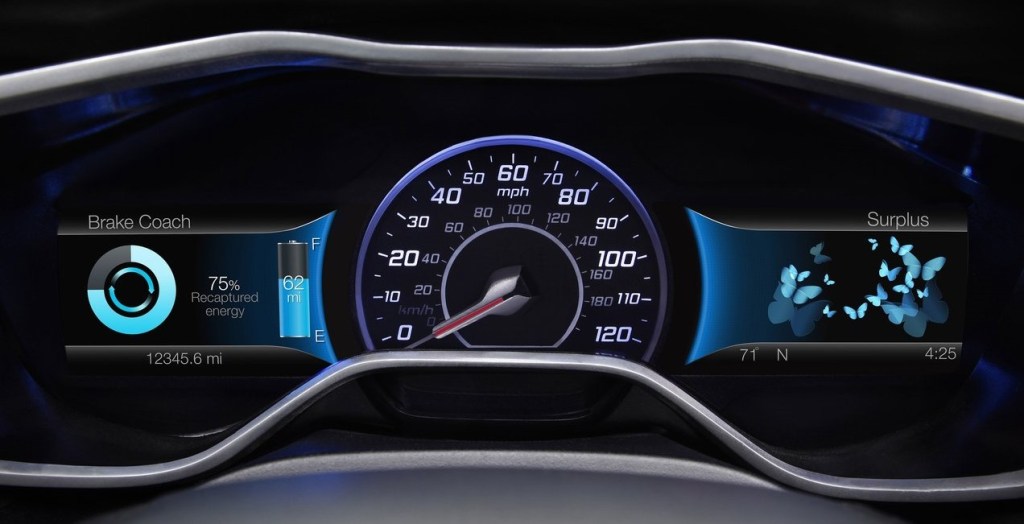
As this was still a niche market, we researched our existing frameworks and point of view with a variety of customers to see where it resonated and where it needed updating. We understood that while it was notionally easy to understand that using electric power in support of a gasoline engine could save gasoline and money, hybrid powertrains were still a very new and curious aspect of their vehicles. We took this as support for our approach, but with a need for more support in terms of coaching or providing an assessment of how well they were leveraging the technology they were driving. In response to this, we developed a very simple Brake Coach, consisting of a simple, circular graphic device that filled to illustrate the proportion of energy of a braking event that was returned to the battery and displayed once the vehicle had come to a stop. This simple concept was very well received because it was easy to see, easy to interpret and easy to act on. It also spoke to the very reason of why they made their purchase. In a way, their ability to return large proportions of energy confirmed the smartness of their decision to buy an electrified vehicle!

While consolidating the content into half the space was daunting, it had its advantages, as a person can only focus on one thing at a time. Having both the powertrain operation and the fuel economy in a single view enabled their relationship to be illustrated, which was a crucial discovery for this cluster design. The notion of unabashedly supporting fuel economy eclipsed the desire to understand the technology or duty cycle of the operation because it reinforced the smartness of their decision to drive a hybrid. Customers have a way of cutting through the things that cloud our judgment as manufacturers: they really wanted to see how the promise of consuming less could be realized. This drove our screen designs to be more relational and imbued with attributes that supported glanceability when seen in the periphery. We supported our visualization with few details and leveraged a strong set of color rules to convey a single point or two at any given time. For instance, the color blue meant electric, the color white was gas, the color green was efficiency and alert yellow was used to highlight high power/low fuel economy. We leveraged a push-pull relationship that illustrated that as the accelerator was pressed to request more torque, power demand rose and pushed fuel economy down; when pressure on the accelerator was more modest, power demand lessened, and fuel economy soared. Despite this being a simple and well-understood concept, it was surprising to hear the amount and the quality of positive comments surrounding this visualization.
Especially with very new technology, manufacturers often think that they can provide a service to educate the driver with as much information or choices that can fit in a screen. We often convince ourselves that since other manufacturers are doing so, to stay competitive, we must do the same. Perhaps, the single most important learning of my career came in an event that we would host with new owners of our products to see how things are working out. Given that hybrids were still new, these were largely early adopters and comparatively well acquainted with the technology. This was 2013 and one customer that I was interviewing about her ownership experience said to me: “I love all the information and the way you are displaying it is exceptional. It is better than my iPhone (hey, the iPhone was still somewhat new at the time!), but it presents a lot for me to think about, which is difficult to do while I’m driving.” With the clarity of this single statement, I would never approach my work the same way. Educating while driving is a fraught exercise sought by those desperate to deliver something (sometimes anything) and too ignorant to accommodate the driver’s primary responsibility to be attentive to the road and maintain the security of all who are on the road with them. It also disregards the fact that drivers also carry the burdens of what else is currently on their mind.
2013 – 2019 Focus Electric EV
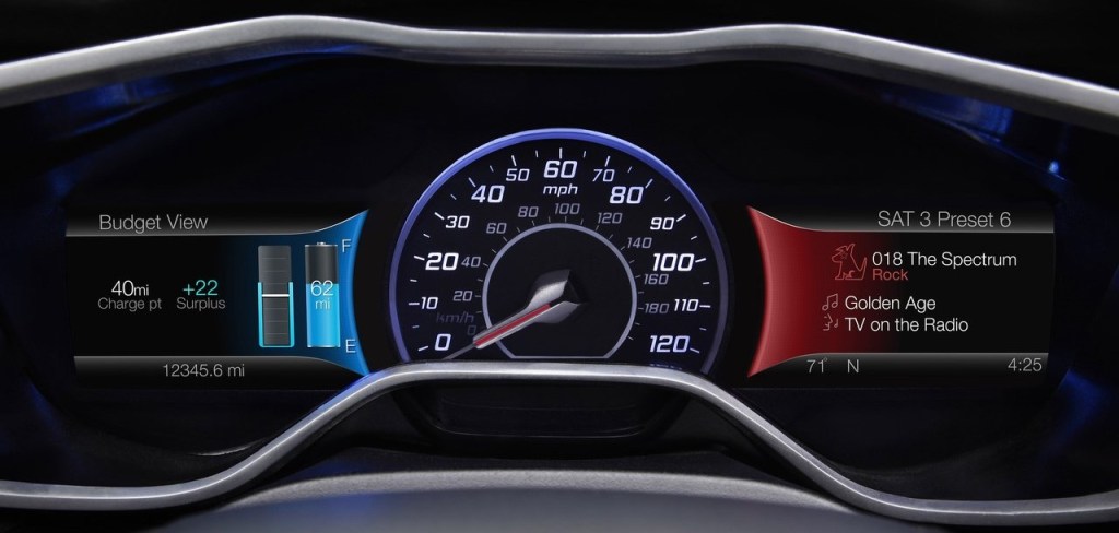
For the Focus Electric, we leveraged the same framework described above for Smartgauge 2, but in the context of a fully electric vehicle. A key difference was around the notion of consumption. Where hybrid drivers were very interested in the fuel economy value (the metric that reinforced the smartness of their decision to choose hybrid), it was quite different for those who chose to drive fully electric. Electricity was comparatively inexpensive and for many of these early adopters, was harvested cleanly for free in the solar arrays they had at their homes. This meant that consumption was only important if it meant they could not get to their next charge-point. Otherwise, they had energy to have fun with! There is a continuum across the market that includes, on one end, those who see no need / desire to be more energy efficient to those who want change, but acknowledge that behavior change is difficult, so they accept the status quo, to others who acknowledge that behavior change is difficult, so they buy a solution to realize the desired change without the burden being solely dependent on their behavior. Here we had a group that felt in terms of consumption, to be further along the continuum, but their behavior was conditional and in some cases, this felt like the first group. They weren’t going to change unless there was a need, but they had the benefit of [comparatively] guilt-free consumption! This drove us to a conditional approach to the display of their range. This is something you see in the Tesla UX today: the condition of whether you are in a trip (with a specific destination or charge-point) or not. If in a trip, we could be deliberate in providing guidance to get to the driver’s destination and quantify the remaining range as a surplus, leaving the driver the discretion to consume that surplus if they desired.
Personally, I quite liked how the Focus Electric cluster came out. We offered more choices than necessary in some things, but we provided a unique point of view on electrified vehicle UX. I enjoyed the privilege to represent Ford’s electrified vehicles as a Subject Matter Expert at the Consumer Electronics Show in Las Vegas on several occasions and, without hesitation, the most enthusiastic conversations I had were with owners of the Focus Electric. It was niche vehicle. It launched with 76 miles of range and to package the batteries, much of the cargo area was compromised. That made it a good fit for a select group of people, but of those folks who came to CES and wanted to chat, they appreciated the uniquely friendly approach the Focus Electric cluster took.
My greatest regret with the Smartgauge 2 clusters for the Focus Electric and the Hybrids was the number of choices we offered – coupled with a hierarchical menu structure. This made wading through the choices time consuming and developing a mental model of the site map difficult. Having more confidence to settle for fewer choices (and embrace a more deliberate point of view) would have lessened the burden of the simple, but rigidly structured menu structure and may have offered an opportunity to use a quicker, more flexible matrix structure.
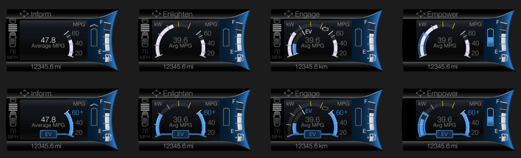
2020 – Current Ford Explorer and Escape Hybrid Vehicles and Lincoln Aviator and Corsair Hybrid Vehicles
Technology today allows over-the-air updates to in-vehicle UX, but this is a somewhat recent development. So, despite what we had learned from our customer touchpoints early on, which led to some incremental simplification in the mid-cycle refresh, we had to wait for the next generation of vehicles to reflect, more thoroughly, what we had learned in a completely new approach.
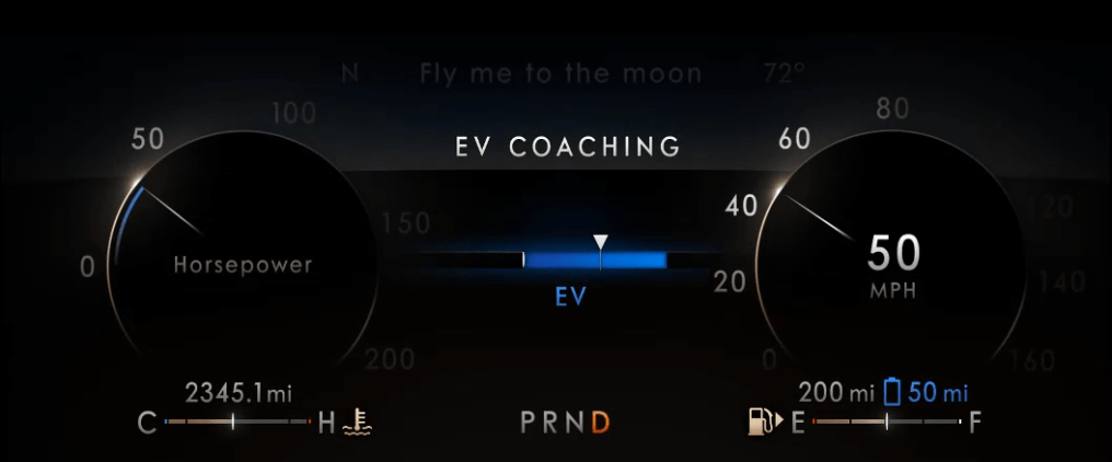
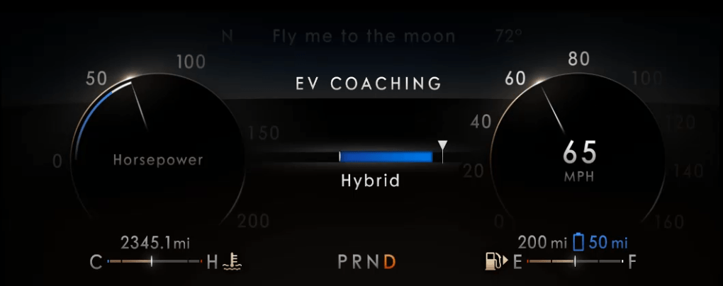
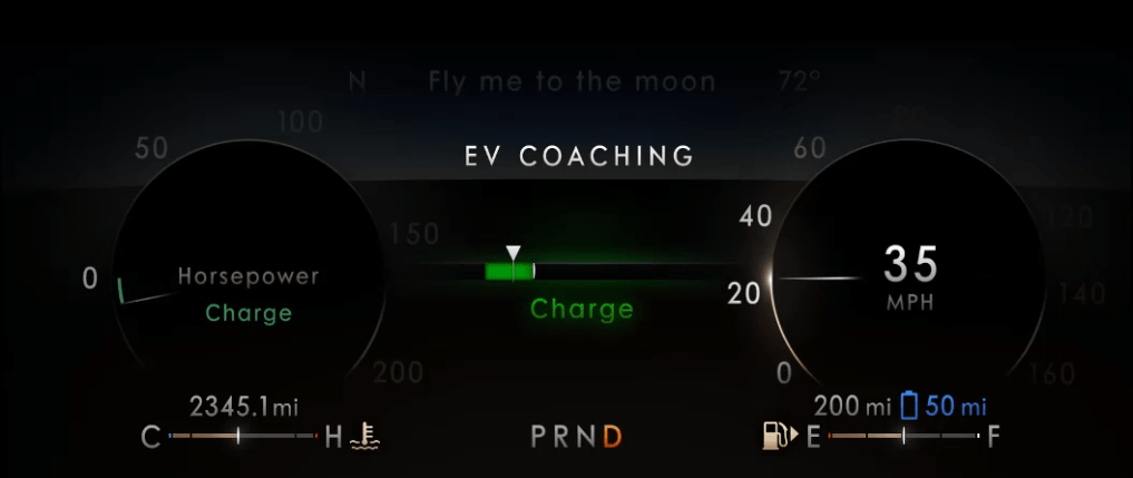
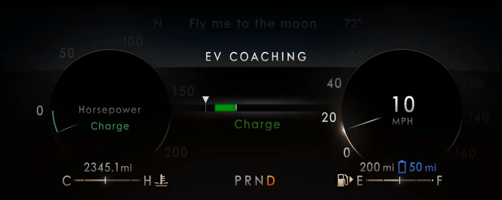
When Ford Motor Company exited the sedan market, I was assigned to lead the functional design and development of the UX for the Instrument Clusters for the electrified versions (hybrid and plug-in hybrid) of the Ford Explorer, Ford Escape, Lincoln Aviator and Lincoln Corsair. A crucial business difference was that Lincoln wanted to message electrification differently than the Ford brand: efficiency for Ford; effortless power for Lincoln. Furthermore, a crucial difference that we learned was that we needed to make the basic content of the instrument cluster very simple for the customer to understand, affirming their purchase decision rather than giving them homework. Any high-minded content would only be available as “opt-in”. This resulted in instrument clusters that were very simple in their default view (the Normal driving mode), with more content brought in, as needed, for the context of the various driving modes that were offered. There was no driving mode associated with “education”, of course, so that content was in the Empower screen, showing the threshold where the engine would turn on/off (transitioning from electric-only to hybrid operation and back) would be available in what we called Information on Demand screens. This content could be selected by the driver to be displayed, in addition to the base content for any given drive mode. With the larger display screens and a more evolved sense of the message we wanted to convey, we refined the graphic approach and used simple words to better describe the phases of operation. We even introduced the concept of visualizing a threshold of where the friction brakes would engage, thus illustrating the transition from electric-only to hybrid braking and back. In these clusters, we called this information the EV Coach.

Eco Coach
One last item that that I’d like to highlight is the Eco Coach. It is relevant because, for many of our customers, they saw the idea of driving in electric-only mode as an efficiency coach, but it isn’t really a coach. Certainly, in a hybrid, you must be asking for little torque if you are able to keep the engine off, but at some point (a much lower point in a full hybrid compared to a plug-in hybrid), to maintain a societally acceptable speed, the engine will eventually pull up. So, we named it EV Coach as it really was coaching to stay in EV, which as the battery was consumed, would ultimately require the engine to fire to recharge the battery and stay on longer to adequately charge a more depleted battery.
The Eco Coach was different. It was a measure of how efficiently the driver was asking for torque, which was contextually evaluated against the prevailing torque (low for flat grades, higher if on an incline or if otherwise loaded with cargo or pulling a trailer) and it was also an assessment of how the driver managed the investment of energy into their motion when confronted with having to slow down or stop. As we researched the concept with customers, we learned about their motivations and their behaviors. While they were interested in consuming less, they were reluctant to have to learn new content, as it is difficult to learn something while you are doing something else! They were also concerned about looking in different places for different information. They just want to drive and, in this case, drive more efficiently. This gave us insight into their scanning behaviors, which very simply was that they scan the cluster for speed information more frequently than anything else. We took the opportunity to associate the Eco Coach to the speedometer – something they innately understand how to interpret and modulate. Taking over, arguably, the most fundamental information in an instrument cluster with evolved content was something we didn’t take lightly, but the introduction of drive modes meant that we could defer this content to the Conserve (or ECO) drive mode, where upon the driver’s choice, it could partner up with different throttle mapping to better help deliver lower consumption through explicit and implicit controls. While this content isn’t for everyone, I do enjoy an indelible memory of one participant in a customer touchpoint we had during development, referring to the device as “almost magical”. This memory is unforgettable because it was endearing and also encouraging! Despite the sober content of the Eco Coach, which, in some ways, is anathema to the fun of driving, we were able to provide something transcendent for some, something that might nudge them to drive differently and consume less. This was due to how we staged new information (consumption) to be responsive to information they already knew how to control (speed), enabling their goal to drive more efficiently…resulting in what was described as an “almost magical” experience. This is a perfect example of my approach to designing interactions through the staging of conditions that satisfy human goals and enable meaningful experiences. In this example, this was done by coupling an elegantly simple analog metaphor that is easy to imagine – one of a loose spring – to another condition that they fundamentally understood and knew how to control. Eco Coach provided seamless integration of its guidance into the basic design of the cluster, providing an encouraging glow that is visible when eyes are up and out and offering a bit more detail with a glance.