This section describes a few noteworthy projects that I was tasked to lead.
Lincoln Continental Head Up Display and Instrument Cluster
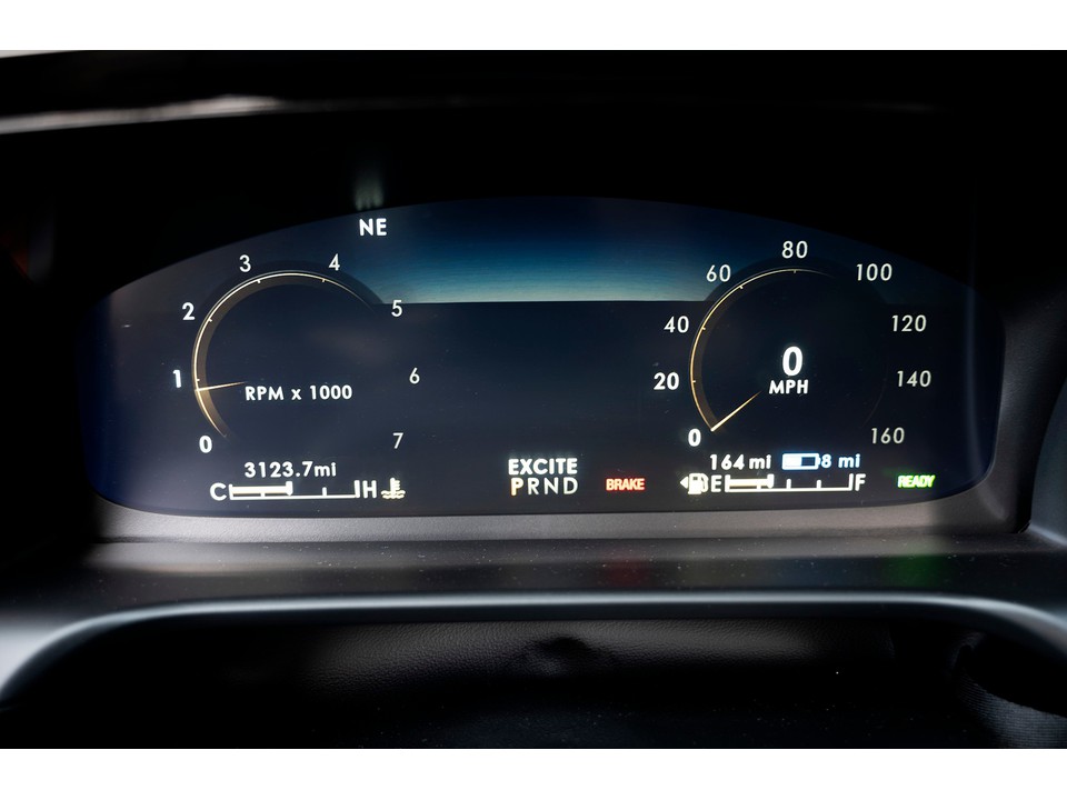
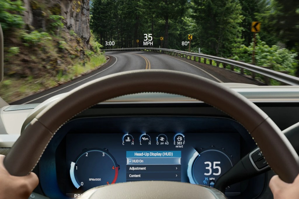
For the renaissance of the venerable Lincoln Continental, I led the functional design and development of the UX for the Head Up Display (HUD) – a first at Ford Motor Company, along with the first fully digital Instrument Cluster. I was responsible to create a structure, skeleton and interaction model for the driver’s interactions with the HUD and the cluster from the steering wheel. I worked very closely with the engineers developing the technology supporting the components and with the designers, who would ultimately develop how to express the content to the customer in warmer, more human and serene terms as the first expression of Lincoln’s Quiet Luxury ethos.
We started with two separate research efforts into better understanding how a HUD and fully digital cluster could work together to best support the goals of the luxury customer. We dug deep into those areas where the two separate studies overlapped and developed a framework to keep the driver Informed and Safe, while leveraging the DLP technology to produce an imminently visible HUD, such that we could minimize the amount of redundancy between the HUD and cluster.
I adapted the structure and interaction model of the 10.1” cluster for the Continental to the mainstream 12.4” cluster format to be used in most Ford Motor Company nameplates even to this day.
Instrument Clusters for MY 2020+ Electrified Variants of Ford Explorer and Escape and Lincoln Aviator and Corsair
As the recognized Subject Matter Expert for Electrified Vehicle UI / UX, I led the functional design and development of the Instrument Cluster UX for the electrified versions (hybrid and plug-in hybrid) of the Ford Explorer, Ford Escape, Lincoln Aviator and Lincoln Corsair. This required tailoring the base content to support the different messaging of how each brand wanted to leverage electrification in their powertrains: efficiency for Ford and effortless power for Lincoln. It also required tailoring the content across two hardware configurations for instrument clusters: fully digital and mechanical dials, plus a display.
12.4″ instrument cluster in Lincoln Aviator and Corsair Plug-in Hybrid models12.4″ instrument cluster in Ford Explorer and Escape Plug-in Hybrid models
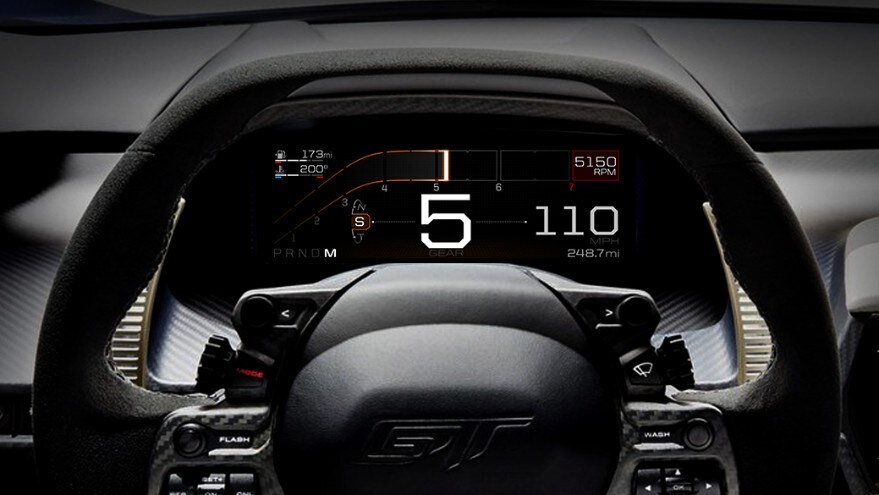
The Ford GT Instrument Cluster
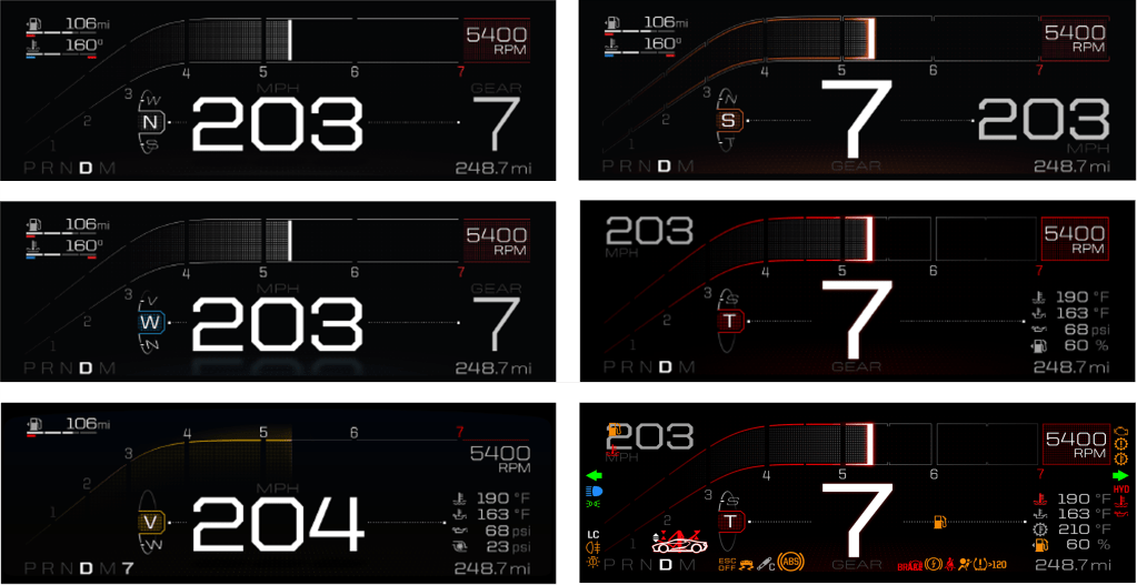
I was brought to the Ford GT team to help them realize the “fit for purpose” vision for their instrument cluster concept, developed with Perception Design. There would want to be a seamless movement of content to best support the functional needs of the different drive modes: optimizing the information content and hierarchy for driving a hypercar ‘on track’ compared to ‘on road’ – or in support of a ‘max velocity’ run. Additionally, the GT team wanted to develop a bespoke GT ‘super-telltale’ to avoid a small, generic vehicle shape that would minimize the glory of the GT silhouette. I developed the structure and interaction model to logically manage the functional safety requirements, as well as the conceptual desires, while still feeling intuitive to the driver and supporting an innate confidence and feeling of being in control.
The different cluster views of the Ford GT. The top 2 on the left are ‘on road’ modes (Normal and Wet), which have the dominant speed and subordinate gear indication. At bottom left is V-Max, which has a dominant speed along with a subdued tachometer and miniscule gear indication. At top right, Sport mode lives in two worlds, with a dominant gear indication like the Track mode, but with a still prominent speed indication. Middle right shows Track, with the dominant gear indication and a very subordinate speed indication that is almost out of view. Bottom right shows the telltale locations, with the ‘super telltale’ in the bottom left corner, just above the PRND.
This section offers some insight into areas of my expertise, namely UX for Head Up Displays, UX for Electrified Vehicles and Interactions, using an Eco Coach for context.
Head Up Displays
For many, driving is easy. However, as our drives have become more connected with the rest of our lives, so has the feeling that our attention is being taxed behind the wheel. A Head Up Display (HUD), as an example of Assisted Reality, offers an opportunity to display a limited amount of information to help a driver interpret their driving context in a location that makes it easy to inform. However, that same location makes it just as easy to distract, so there needs to be a considerate filter for what content makes it into a HUD. At a fundamental level, the HUD must support the driver’s sense of confidence and in so doing, support the sense of security for the passengers on board.
HUD designs often go wrong when they are designed like an instrument cluster – commonly done in the name of consistency. As Emerson said: “A foolish consistency is the hobgoblin of little minds…” and not recognizing the fundamental difference between an instrument cluster and a HUD is where the foolishness sets root. In a cluster, which is a closed-back display, the designer can prescribe the hierarchy of content. Conversely, a HUD is an open-backed display that is projected on the windshield of an automobile. It is open to the environment that the driver is tasked with managing … and hurtling toward. Here, the environment is the star of the show, while the displayed content plays the role of a supporting actor – coming to the fore when the scene requires support and stepping back when none is needed. Acknowledging that the environment is the star is a key attribute for designing a HUD that is a great HUD rather than designing a HUD that is a middling cluster. This means keeping persistent or status info as low or off to the side of the field of view as possible, not exaggerating the size of content to fill the space and not over-designing the assets to attract too much attention. It also means thinking about how to use the natural environment in the staging of content, which isn’t a skill used in cluster design. You sometimes see content displayed in a HUD that was obviously designed for an instrument cluster, or other closed-back display. An example of this might be the avatar of a vehicle providing a reference for information, such as the pitch and roll the vehicle. But this design presents an existential abstraction of one’s vehicle out in front of one’s vehicle. In this case, the result is over-designed content that missed the opportunity to leverage the horizon to deliver simplicity.
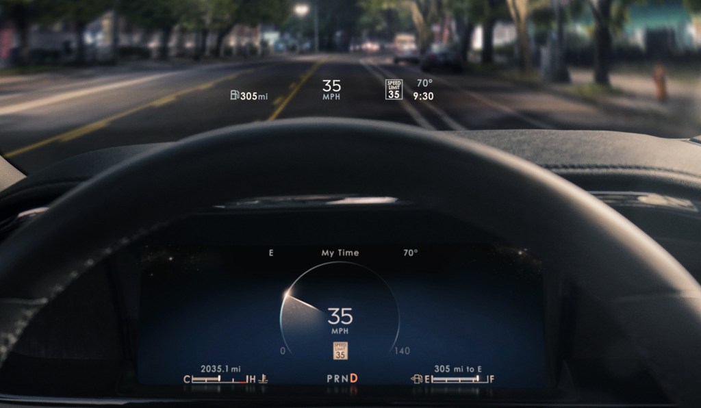
The approach that I developed for Lincoln’s Head Up Displays (and most recently, the 2023 Ford Super Duty) is:
Keep most things quiet, clear and out of the way
Simplify, by being responsive to the view of the environment, where possible
Leave yourself some room at the center of the stage to invite the driver’s attention, when needed.
It is a less-pushy means of supporting the relationship.
Lincoln Continental Head Up Display and Instrument ClusterLincoln Aviator Head Up Display and Instrument ClusterThe Lincoln Corsair HUD, while 20% narrower than that in the Aviator, manages similar functionality through conditional content shifts.2023 Ford Super Duty HUD in Normal view2023 Ford Super Duty HUD in Towing view
Electrified Vehicle UI / UX
I learned my approach to Electrified Vehicle UX as a supporting member of the team the developed Smartgauge with Eco Guide, the seminal instrument cluster of the 2010 Ford Fusion Hybrid. The focus of that cluster was on research insights that suggested different levels of engagement to enable customers to learn about how their vehicle operated in graduated steps and, ultimately, choose whichever level of engagement felt most comfortable for them. On top of this, there was a desire to provide a stunning design to support the evangelizing of early adopters as they fielded “Why hybrid?” questions from their curious neighbors.
Smartgauge with Eco Guide in the 2010 Ford Fusion Hybrid
2013 – 2019 Ford Fusion Hybrid and C-Max Hybrid
I then led the UX development of Smartgauge 2. At the time, Ford was marketing MyFord Touch, which compartmentalized vehicle information on a screen to the left of the speedometer and infotainment content displayed on a screen to the right. For showroom consistency, Ford wanted this approach across all of its vehicles. For Smartgauge 2, this meant consolidating all the hybrid operation content to the one screen left of the speedometer – a screen that is about half the area of an iPhone 12 display. This business requirement, plus a Design requirement to present the information with a more traditional gauge appearance, set the brief for Smartgauge 2.
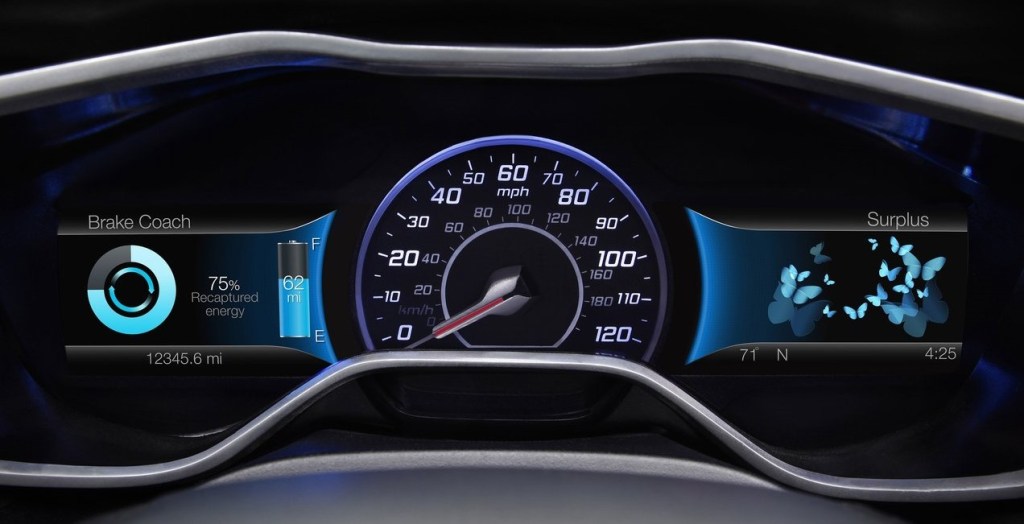
As this was still a niche market, we researched our existing frameworks and point of view with a variety of customers to see where it resonated and where it needed updating. We understood that while it was notionally easy to understand that using electric power in support of a gasoline engine could save gasoline and money, hybrid powertrains were still a very new and curious aspect of their vehicles. We took this as support for our approach, but with a need for more support in terms of coaching or providing an assessment of how well they were leveraging the technology they were driving. In response to this, we developed a very simple Brake Coach, consisting of a simple, circular graphic device that filled to illustrate the proportion of energy of a braking event that was returned to the battery and displayed once the vehicle had come to a stop. This simple concept was very well received because it was easy to see, easy to interpret and easy to act on. It also spoke to the very reason of why they made their purchase. In a way, their ability to return large proportions of energy confirmed the smartness of their decision to buy an electrified vehicle!
Brake Coach, as displayed in the second generation of Smartgauge, shown here from a 2020 Ford Fusion Hybrid.
While consolidating the content into half the space was daunting, it had its advantages, as a person can only focus on one thing at a time. Having both the powertrain operation and the fuel economy in a single view enabled their relationship to be illustrated, which was a crucial discovery for this cluster design. The notion of unabashedly supporting fuel economy eclipsed the desire to understand the technology or duty cycle of the operation because it reinforced the smartness of their decision to drive a hybrid. Customers have a way of cutting through the things that cloud our judgment as manufacturers: they really wanted to see how the promise of consuming less could be realized. This drove our screen designs to be more relational and imbued with attributes that supported glanceability when seen in the periphery. We supported our visualization with few details and leveraged a strong set of color rules to convey a single point or two at any given time. For instance, the color blue meant electric, the color white was gas, the color green was efficiency and alert yellow was used to highlight high power/low fuel economy. We leveraged a push-pull relationship that illustrated that as the accelerator was pressed to request more torque, power demand rose and pushed fuel economy down; when pressure on the accelerator was more modest, power demand lessened, and fuel economy soared. Despite this being a simple and well-understood concept, it was surprising to hear the amount and the quality of positive comments surrounding this visualization.
Especially with very new technology, manufacturers often think that they can provide a service to educate the driver with as much information or choices that can fit in a screen. We often convince ourselves that since other manufacturers are doing so, to stay competitive, we must do the same. Perhaps, the single most important learning of my career came in an event that we would host with new owners of our products to see how things are working out. Given that hybrids were still new, these were largely early adopters and comparatively well acquainted with the technology. This was 2013 and one customer that I was interviewing about her ownership experience said to me: “I love all the information and the way you are displaying it is exceptional. It is better than my iPhone (hey, the iPhone was still somewhat new at the time!), but it presents a lot for me to think about, which is difficult to do while I’m driving.” With the clarity of this single statement, I would never approach my work the same way. Educating while driving is a fraught exercise sought by those desperate to deliver something (sometimes anything) and too ignorant to accommodate the driver’s primary responsibility to be attentive to the road and maintain the security of all who are on the road with them. It also disregards the fact that drivers also carry the burdens of what else is currently on their mind.
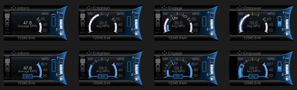
Smartgauge 2, displaying the Empower gauge on the left, with its dynamic engine pull-up threshold and the updated imagery of the Efficiency Leaves on the left screen.Left to right are the 4 levels of engagement in Smartgauge 2, showing the operation of the hybrid powertrain in hybrid operation on top and electric drive on the bottom.
2013 – 2019 Focus Electric EV
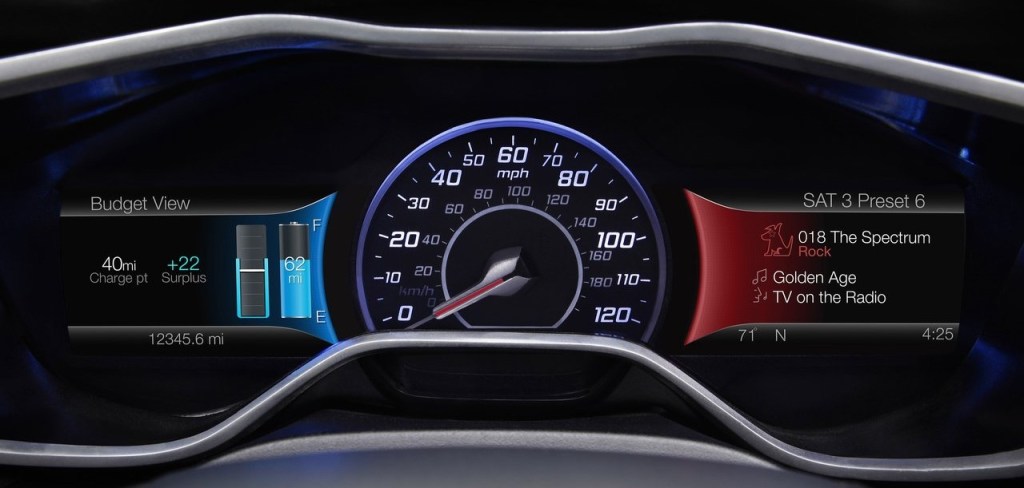
For the Focus Electric, we leveraged the same framework described above for Smartgauge 2, but in the context of a fully electric vehicle. A key difference was around the notion of consumption. Where hybrid drivers were very interested in the fuel economy value (the metric that reinforced the smartness of their decision to choose hybrid), it was quite different for those who chose to drive fully electric. Electricity was comparatively inexpensive and for many of these early adopters, was harvested cleanly for free in the solar arrays they had at their homes. This meant that consumption was only important if it meant they could not get to their next charge-point. Otherwise, they had energy to have fun with! There is a continuum across the market that includes, on one end, those who see no need / desire to be more energy efficient to those who want change, but acknowledge that behavior change is difficult, so they accept the status quo, to others who acknowledge that behavior change is difficult, so they buy a solution to realize the desired change without the burden being solely dependent on their behavior. Here we had a group that felt in terms of consumption, to be further along the continuum, but their behavior was conditional and in some cases, this felt like the first group. They weren’t going to change unless there was a need, but they had the benefit of [comparatively] guilt-free consumption! This drove us to a conditional approach to the display of their range. This is something you see in the Tesla UX today: the condition of whether you are in a trip (with a specific destination or charge-point) or not. If in a trip, we could be deliberate in providing guidance to get to the driver’s destination and quantify the remaining range as a surplus, leaving the driver the discretion to consume that surplus if they desired.
The 2012 Ford Focus Electric instrument cluster showing the Budget View on the left and the ‘What’s Playing Now?’ screen on the right side of the speedometer.The 2012 Ford Focus Electric instrument cluster displaying the Brake Coach at left and the Surplus screen on the right, with butterflies flying in or out as surplus miles (miles beyond one’s destination) are saved or consumed, respectively.
Personally, I quite liked how the Focus Electric cluster came out. We offered more choices than necessary in some things, but we provided a unique point of view on electrified vehicle UX. I enjoyed the privilege to represent Ford’s electrified vehicles as a Subject Matter Expert at the Consumer Electronics Show in Las Vegas on several occasions and, without hesitation, the most enthusiastic conversations I had were with owners of the Focus Electric. It was niche vehicle. It launched with 76 miles of range and to package the batteries, much of the cargo area was compromised. That made it a good fit for a select group of people, but of those folks who came to CES and wanted to chat, they appreciated the uniquely friendly approach the Focus Electric cluster took.
My greatest regret with the Smartgauge 2 clusters for the Focus Electric and the Hybrids was the number of choices we offered – coupled with a hierarchical menu structure. This made wading through the choices time consuming and developing a mental model of the site map difficult. Having more confidence to settle for fewer choices (and embrace a more deliberate point of view) would have lessened the burden of the simple, but rigidly structured menu structure and may have offered an opportunity to use a quicker, more flexible matrix structure.
2020 – Current Ford Explorer and Escape Hybrid Vehicles and Lincoln Aviator and Corsair Hybrid Vehicles
Technology today allows over-the-air updates to in-vehicle UX, but this is a somewhat recent development. So, despite what we had learned from our customer touchpoints early on, which led to some incremental simplification in the mid-cycle refresh, we had to wait for the next generation of vehicles to reflect, more thoroughly, what we had learned in a completely new approach.
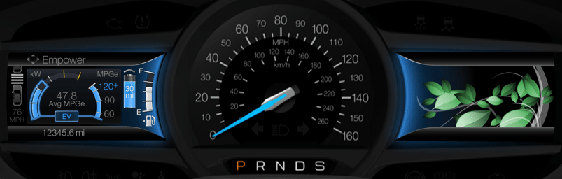
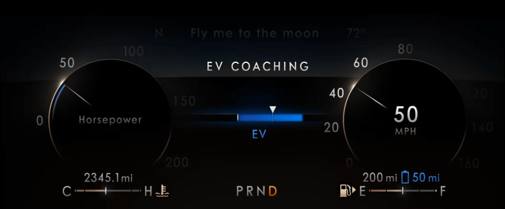
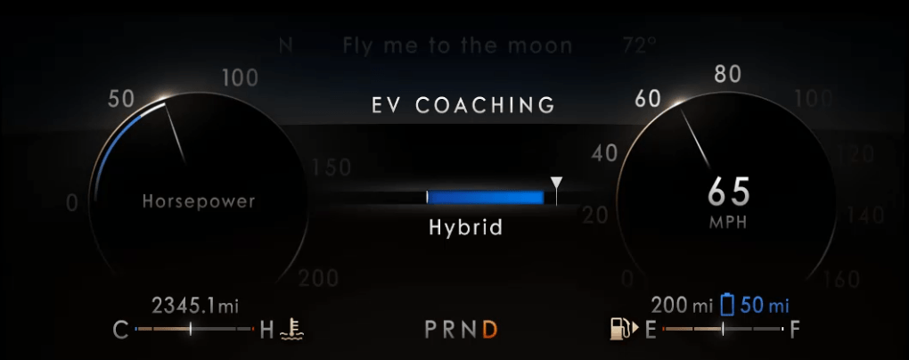
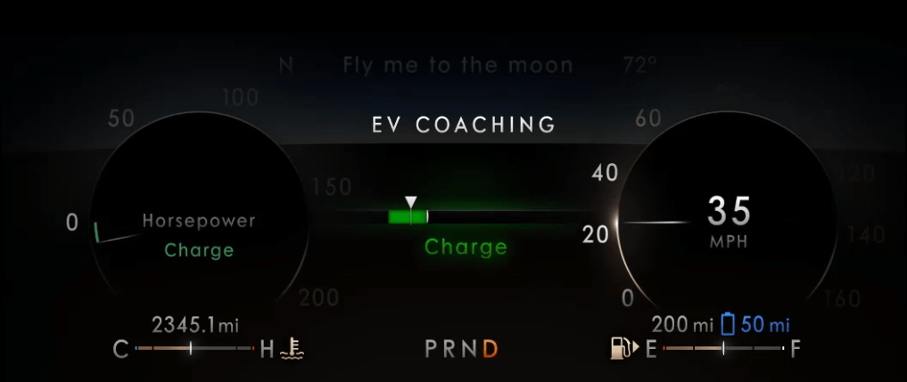
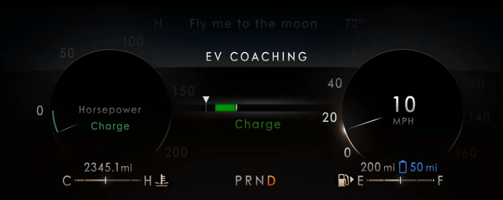
When Ford Motor Company exited the sedan market, I was assigned to lead the functional design and development of the UX for the Instrument Clusters for the electrified versions (hybrid and plug-in hybrid) of the Ford Explorer, Ford Escape, Lincoln Aviator and Lincoln Corsair. A crucial business difference was that Lincoln wanted to message electrification differently than the Ford brand: efficiency for Ford; effortless power for Lincoln. Furthermore, a crucial difference that we learned was that we needed to make the basic content of the instrument cluster very simple for the customer to understand, affirming their purchase decision rather than giving them homework. Any high-minded content would only be available as “opt-in”. This resulted in instrument clusters that were very simple in their default view (the Normal driving mode), with more content brought in, as needed, for the context of the various driving modes that were offered. There was no driving mode associated with “education”, of course, so that content was in the Empower screen, showing the threshold where the engine would turn on/off (transitioning from electric-only to hybrid operation and back) would be available in what we called Information on Demand screens. This content could be selected by the driver to be displayed, in addition to the base content for any given drive mode. With the larger display screens and a more evolved sense of the message we wanted to convey, we refined the graphic approach and used simple words to better describe the phases of operation. We even introduced the concept of visualizing a threshold of where the friction brakes would engage, thus illustrating the transition from electric-only to hybrid braking and back. In these clusters, we called this information the EV Coach.
Instrument Cluster in Ford Explorer PHEV or Ford Escape PHEVInstrument Cluster in Lincoln Aviator PHEV or Lincoln Corsair PHEVLincoln EV Coaching showing the vehicle currently driving in EV, with the power demand about half of what would pull up the gasoline engine (triangular chaplet about halfway though the blue bar in the center).Lincoln EV Coaching showing the vehicle currently driving in Hybrid operation, with the power demand just beyond the capability to drive on battery alone.Lincoln EV Coaching showing the vehicle decelerating capturing all of the available kinetic energy (triangular chaplet within the green bar), subtly celebrating this event with a bright green ‘charge’ indication and green glow.Lincoln EV Coaching showing the vehicle decelerating beyond the ability of the regenerative braking system alone (triangular chaplet left of the green bar), indicating that the vehicle’s friction brakes are dissipating some of the vehicle’s kinetic energy away as heat.
Eco Coach
One last item that that I’d like to highlight is the Eco Coach. It is relevant because, for many of our customers, they saw the idea of driving in electric-only mode as an efficiency coach, but it isn’t really a coach. Certainly, in a hybrid, you must be asking for little torque if you are able to keep the engine off, but at some point (a much lower point in a full hybrid compared to a plug-in hybrid), to maintain a societally acceptable speed, the engine will eventually pull up. So, we named it EV Coach as it really was coaching to stay in EV, which as the battery was consumed, would ultimately require the engine to fire to recharge the battery and stay on longer to adequately charge a more depleted battery.
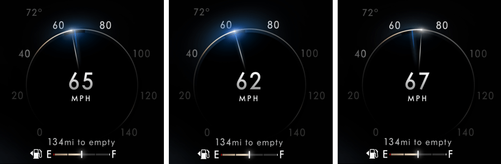
The Eco Coach was different. It was a measure of how efficiently the driver was asking for torque, which was contextually evaluated against the prevailing torque (low for flat grades, higher if on an incline or if otherwise loaded with cargo or pulling a trailer) and it was also an assessment of how the driver managed the investment of energy into their motion when confronted with having to slow down or stop. As we researched the concept with customers, we learned about their motivations and their behaviors. While they were interested in consuming less, they were reluctant to have to learn new content, as it is difficult to learn something while you are doing something else! They were also concerned about looking in different places for different information. They just want to drive and, in this case, drive more efficiently. This gave us insight into their scanning behaviors, which very simply was that they scan the cluster for speed information more frequently than anything else. We took the opportunity to associate the Eco Coach to the speedometer – something they innately understand how to interpret and modulate. Taking over, arguably, the most fundamental information in an instrument cluster with evolved content was something we didn’t take lightly, but the introduction of drive modes meant that we could defer this content to the Conserve (or ECO) drive mode, where upon the driver’s choice, it could partner up with different throttle mapping to better help deliver lower consumption through explicit and implicit controls. While this content isn’t for everyone, I do enjoy an indelible memory of one participant in a customer touchpoint we had during development, referring to the device as “almost magical”. This memory is unforgettable because it was endearing and also encouraging! Despite the sober content of the Eco Coach, which, in some ways, is anathema to the fun of driving, we were able to provide something transcendent for some, something that might nudge them to drive differently and consume less. This was due to how we staged new information (consumption) to be responsive to information they already knew how to control (speed), enabling their goal to drive more efficiently…resulting in what was described as an “almost magical” experience. This is a perfect example of my approach to designing interactions through the staging of conditions that satisfy human goals and enable meaningful experiences. In this example, this was done by coupling an elegantly simple analog metaphor that is easy to imagine – one of a loose spring – to another condition that they fundamentally understood and knew how to control. Eco Coach provided seamless integration of its guidance into the basic design of the cluster, providing an encouraging glow that is visible when eyes are up and out and offering a bit more detail with a glance.
The Lincoln Eco Coach, shown here in three states: at left, showing the speedometer needle under the target, indicative of slowing down too aggressively. In the middle, the speedometer needle is on the target, resulting in a conspicuous glow. At right, the speedometer needle is ahead of the target, indicating an overspeed condition.
This section provides examples of where my work was able to significantly change how Ford did its business in Human Machine Interface (HMI) or where it contributed to Ford Motor Company significantly impacting Automotive Industry UX. This is in chronological order, so the most recent examples are down further in the post.
Since the mid 2000s, I have been the UX specialist at Ford Motor Company that has been charged with leading change in their Human Machine Interface (HMI).
This started with building compelling strategic business cases to support a move from DIN radios that were not sympathetic to the design of the rest of the interior.
A comparison of the 2005 Ford Fusion center-stack with a DIN radio on the left, the rectangular outline of which is in tension to the trapezoidal finish panel. On the right, a 2010 Ford Fusion with a more integrated appearance of the controls and the finish panel.
Learning from a Standout Success
With the success of Ford’s first generation of SYNC, I was selected to be part of a small team to develop the evolution of that product. This was a fantastic project that Ford had contracted with IDEO to lead. On this project, as well as the Smartgauge project for the 2010 Ford Fusion Hybrid instrument cluster, also led by IDEO, I learned much of what would become the foundation of my work going forward, from research methods to data synthesis to ideating on how to solve for the needs of our customers. The output of this project was what we called MyFord Touch, which, while well-intentioned, was unfortunately, a flawed product. Its flaws are well documented; however, from a change perspective, the HMI in Ford vehicles would never be the same, as this product -at its core – acknowledged that customers were looking to be more connected to their lives outside of their car. My interaction concept was to eliminate the typical status information bar and, instead, add status information to the domain launch buttons, themselves. On top of this, we would locate the domains in the corners to ease both finding and actuating the button with the tactile support afforded from the surrounding bezel. Ford chose to go forward with the ‘4 corners concept’ and it was granted a design patent, as it was unlike anything else in the industry. The uniqueness of this design was so identifiable that it was also featured as a ‘frame’ for the telestrator on the NFL on Fox pregame show!
We also introduced another significant change to the industry with an instrument cluster that acknowledged the increased desire for connectivity. Uniquely, our instrument cluster provided as much space to infotainment content as it provided for vehicle status, with dedicated displays for each flanking the speedometer. On the steering wheel, we provided unparalleled functionality to the driver through controls dedicated to managing the two displays in the instrument cluster. Introduced at the 2009 Consumer Electronics Show in Las Vegas, it was an influential shot across the bow of the industry.
The 2007 Ford Edge on the left and on the right, the 2012 Ford Edge, the launch vehicle for the MyFord Touch user experience.
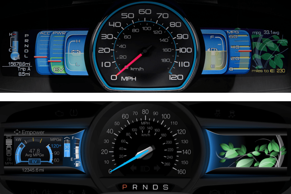
Throughout this project, I was seen as the driving influence in HMI at Ford Motor Company. My assignment was to lead the evolution of the breakthrough Smartgauge instrument cluster from the 2010 Ford Fusion Hybrid to accomplish two things: support showroom consistency with the MyFord Touch instrument clusters and to make the HMI in electrified vehicles more accessible to a growing customer base that was embracing changes in powertrain offerings.
A comparison of the original Smartgauge and the Smartgauge v2 instrument clusters. The second generation consolidated vehicle operation to the screen left of the speedometer and, while the leaves fill the right side display in this image, the right side display could also display Audio, Phone or Navigation status, like the other MyFord Touch clusters.
Change Sometimes Brings Lessons Hard Learnt
While working on the second generation of Smartgauge, issues with MyFord Touch began to surface. Among the critical reliability and responsiveness concerns that surfaced, there were usability issues as well. A crucial learning here was that while MyFord Touch delivered a lot of what customers wanted, we did not do enough validation of our concepts to ensure that the priority of their desires was managed well enough to keep the interactions simple and quick. We tried to give them everything!
In order not to repeat the stumbles with MyFord Touch, Ford Motor Company hired Parrish Hanna to lead the Global HMI team. He ushered in a cultural transformation that doubled down on touchpoints with customers to create and deliver products that better met their needs. Under his leadership, many improvements were introduced for MyFord Touch. At the end of its run, MyFord Touch enjoyed industry leading quality, which carried forward in the tremendous launch of its successor, Sync 3.
Establishing New Markets
Since my role was about change, either developing HMI to make new technologies accessible or changing the way Ford delivered HMI to better take advantage of new technologies, I was not involved in the ongoing product development of MyFord Touch or its evolution to Sync 3. Instead, I was tapped to lead the development of the HMI for the renaissance of the 2016 Ford GT and the 2017 Lincoln Continental, which featured Ford Motor Company’s first fully digital instrument clusters and, on the Continental, their first ever Head Up Display. While these products did not have the industry scope of Sync 3, they both represented very visible investment in markets that were very important to Ford: returning Ford to success at Le Mans to honor the legacy of one of motorsport’s greatest successes and returning a somnolent Lincoln brand to the status it rightfully enjoyed as an esteemed luxury marque. Both of these products enjoyed successful launches regarding their HMI as they, too, benefited from a culture that embraced a better understanding of the customer’s goals to inform our work.
2017 Ford GT 10.1″ instrument cluster2017 Lincoln Continental 10.1″ instrument cluster
Updating the Entire Portfolio
It is a very easy thing to assume that since we are also customers of these products, our drive to address the issues that bother us are representative of the concerns of the general marketplace. This assumption is flawed due to our higher than average education and our unique immersion in the automotive world. While some would argue that some ultra-successful customer electronics companies don’t do as many customer touchpoints as we do, the point is simply irrelevant because those companies do not have to be held to the same standard as automotive UX: when a customer interacts with those products, their focus is on the product; using the product is paramount and mistakes have few consequences. In automotive UX, when the customer interacts with the HMI, their focus is typically on something else; driving well is paramount and mistakes can be catastrophic.
With the success of the fully digital clusters in the Continental and Ford GT, I was assigned to translate the foundations of those two very disparate clusters to a common structure that could convincingly be used across the varied portfolio from Fiesta to F-series. These new fully digital clusters would have to improve on the experience of instrument clusters in our most iconic vehicles, like the double-barreled instrument cluster of Mustang.
To develop a strategy that would support the breadth of the portfolio, I had to work with Marketing to understand the needs of the various product segments, with Vehicle Engineering team to understand the vehicle dynamics differences associated with the different drive mode offerings (to better suit different driving contexts, like slippery roads, off-roading, eco-driving, etc.) and with Design to understand the flexibility of how they wanted to present the information across the breadth of vehicle programs. I developed a modular strategy with fixed foundational content across all modes, conditionally fixed additional content within each mode and tunable, or opt-in content, that could be visible in any mode and shepherded it through the escalation of various approvals. This general structure launched in 2018 with the Mustang and Navigator and is seen in most Ford Motor Company vehicles today.
In the two images above, you see two very different instrument clusters in the Mustang and the Navigator, built upon a very common, modular structure.
A New UX for a Revolutionary New Mustang
The earliest days of the Mustang Mach-E were trying times. Ford wanted to make a more deliberate step into the tenuously growing market of electric vehicles than it had with the Focus Electric, but it was having a difficult time managing the tensions of the heavy investment and its culture of managing corporate CAFE standards to support its most important nameplates, the F-Series. In practice, this meant that the deep passion it had for understanding and serving the F-Series customer was typically not repeated for smaller cars that weren’t as integral to the identity of Ford Motor Company. This meant that the initial incarnation of the all-new c-sized electric vehicle was being developed as a “compliance car” – something that would achieve its goals of energy efficiency, but without much investment in establishing a passionate customer base. To their credit, the most senior management at Ford realized the futility of this exercise and directed a prophetic change in direction. They were going to develop an all-new c-sized electric vehicle specifically targeted at a passionate customer base and one that would deliberately become integral to the identity of Ford Motor Company: a Mustang EV!
To avoid the gravitational pull toward corporately conservative product development, a skunkworks team of change agents were isolated off-campus and given license to create history the future. I was part of this team to usher in a new user experience for this revolutionary new Mustang.
Because this was a Mustang, the silhouette and proportions of the vehicle were very important to identify this vehicle as a Mustang, even though it was an EV and a Sport Utility. On the interior, it was important to maintain the tradition of a dual cowl instrument panel, or dashboard, but there was a strong desire to simplify and modernize the gesture of the dashboard and a very deliberate direction to eliminate switchgear and focus the interactions to the touchscreen, as Tesla had done. Since in an EV there is generally less information for a driver to keep track of, it was decided that we would employ a small instrument cluster, with a very simple interface to prioritize Speed and Range to counterbalance the large touchscreen that would dominate the interior.
The Mustang Mach-E instrument cluster, simply focusing on what’s most important to EV drivers: Speed and Range. In this example, it is also showing the status of the driver assistance systems.
To better support the driver’s confidence as they transition to an EV (potentially from a visceral Mustang GT), I worked to simplify the switches on the steering wheel to better suit the simple instrument cluster with which they interfaced. This was also done in acknowledgement that a large, bright touchscreen was likely going to invite interactions there. We were limited to an existing corporate switch, so a real development into switches to optimally support confident interaction was impossible, but we reduced the clutter of switches on the steering wheel. I had lobbied to locate the instrument cluster higher in the driver’s gaze, viewable above rather than though the steering wheel in another effort to support confidence by keeping eyes up and out. Unfortunately, this was not possible, as this would have required a new steering wheel, which is a very expensive and time-consuming development, given the criticality of understanding the myriad safety implications of a steering wheel to a driver’s body in the event of an accident. While I was not able to get all of what I was after, I was happy to have created a simple, deliberate Steering Wheel / Instrument Cluster interface.
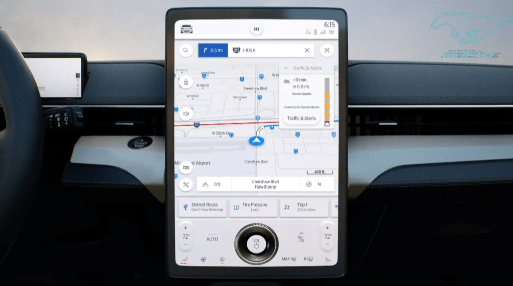
In the touchscreen, our team developed the Dash Card interface, which received a design patent. The heart of the Dash Card interface was in eschewing the traditional static domain launchers for Navigation, Audio and Phone for dynamic Dash Cards that would reflect a driver’s most recent application selections in the touchscreen. If the driver’s application selections were traditional, then the typical domains of Navigation, Audio and Phone would be present as Dash Cards that would launch the app when touched. If, however, the driver’s application selections weren’t typical (perhaps they were accessing a new suite of apps being developed or checking in more frequently on their energy consumption as they got up to speed with the intricacies of a new powertrain), those apps would be displayed in their set of Dash Cards, representing their recent interests and facilitating a quick and easy switch between the apps that satisfied their curiosities of the moment.
The Dash Card touchscreen interface in the Mustang Mach-E. The Dash Cards are minimized in this image, sitting just below the map and above the knob, offering one-touch access to Detroit Rocks on USB, Tire Pressure or Trip 1. Once another app is launched, the map will assume the Dash Card location closest to the driver and Trip 1 will move off screen to the right.
The Mustang Mach-E launched to much acclaim and is generally regarded as a success. There were several constraints that we had to manage to best support the interactions of the driver and passengers, from package and hardware decisions to support the importance of an exterior silhouette, to corporate decisions to be like Tesla, to a comparatively short timeline for the program – all of which had pros and cons. Perhaps my favorite critique of the Mustang Mach-E was in a comparison to Tesla’s Model Y, done by BBC’s Top Gear, in January 2021:
“If you like your tech on the bleeding edge and your furniture minimal, the Y is your choice. But if you just want to drive an electric car that keeps you safe and doesn’t try to dazzle you, the Mach-E is on point. It’s the less demanding, easier to interact with car.”
This critique is a favorite of mine because it coincides with the next seismic event in formulating my point of view on how to provide a confident and rewarding in-vehicle user experience.
Fundamentally Changing Interior Architecture Through Understanding Customer Goals for In-Vehicle Interactions
As my work on the Mustang Mach-E UX began to subside, I had an opportunity to consider the insights and tensions I had witnessed in content that was pushed or pulled by customer needs and business needs across the span of markets I had the opportunity to immerse myself in over the prior few years of work. I was able to go deep in luxury, performance, and electrified vehicles, and in the cross-carline work on drive modes. I had access to insights on the Trucks and SUVs that millions drive daily. In each individual project, one is driven to provide answers for that project, but from a higher-level view across the different projects, a single question surfaced: How might we optimize interactions in our vehicles to better support the goals of customers across the globe? Are there patterns out there that might better inform the What, Where and How we stage interactions for our customers?
In late 2018 and for the duration of 2019, I led a global research effort to better understand customer goals for in-vehicle interactions. Together with my colleague, Curtis To, who had consolidated hundreds of customer research papers into a framework of human goals, we created a variety of conceptual provocations that probed on how to satisfy those goals through variations in the interactions with controls, displays and content distributed across the instrument panel and on their brought-in devices. The variety of provocations were configured into four unique interaction architectures. We interviewed hundreds of drivers, together with first-row passengers that they often traveled with, on their thoughts of interacting with these provocations during simulated driving journeys. We were able to look at comparisons both within and between subjects across the variety of interaction concepts and, without giving too much away, we did find patterns across the globe. We were gratified to see that what we had learned from our research on interactions in the vehicle was consistent with research that explored how people live with technology in their world outside the vehicle. This surfaces a tension in the desire to have seemingly unlimited connectivity with the rest of their world and the capacity to manage those connections with the demands of the moment – leading to distraction and anxiety. It also points to a gap in how the design of in-vehicle interactions are challenged to be completed within the budget of available attention, undermining confidence behind the wheel. I appreciate the Top Gear characterization of the Mach-E being a car that is ‘easier to interact with’ and see that as a step in the right direction, and wonder how much more could have been accomplished?
We distilled our research into a few distinct insights and tensions that informed three high-level interaction principles. Our research findings were very well received and became a core input to Ford’s updated display strategy. This has led to significant and very visible changes in the cockpit display configurations that will be coming to market in the next year, or so.
Interaction Principles and Interaction DNA
As a result of the response to the research, I was asked to develop interaction principles to provide guidance to the HMI team and to establish more consistency in the interactions being developed at Ford. We called this an interaction DNA. During the regular course of business, ideas from other industries or from competitors are often discussed as good ideas to consider… or duplicate. When these ideas are raised by senior managers, the pressure to respond quickly tends to tilt the scale toward duplication, albeit with cosmetic updates. This process necessarily takes the customer out of the picture as the ‘what’ to duplicate is seldom accompanied by an understanding of ‘why’ the solution was developed in the first place – let alone whether it is a good fit for the Brand. This, of course, is the wrong way around. If you have a compelling ‘why’, given enough time, it is a rather straightforward process to develop a compelling ‘what’ or suite of ‘whats’ that have a unifying thread in their ‘why.’
On the topic of the ‘why’, the importance of aligning a solution to the Brand should not be underestimated. When marketing is effective, it clearly describes why a particular Brand stands tallest among its competitors for the things it represents. If those things are important to a potential customer, it sets expectations – or, creates ‘whys.’ Given that marketing often describes the Brand through aspirational scenes of capability or personal / social fulfilment, the interactions a customer has on their test drive need to confidently assure them that those aspirations are possible, fulfilling the promise and converting on that customer’s potential.
Thus, the interaction principles were developed to jointly support the goals of the user and to support or even celebrate the Brand. In automotive, the user with the most stringent goals is the driver, as their primary responsibility is to support public safety. Because the driver’s attention is on the road, the design of interactions needs to be seen through a lens akin to the Hippocratic Oath: “first, do no harm”. This means that the attention required to complete the interaction must not undermine the attention needed to responsibly drive the vehicle. In practice, this means that the design of interactions must support keeping the driver’s eyes and mind on the road. To guide the global HMI team, I developed 10 interaction principles focused on supporting those two objectives in an automotive context. When the interaction design accounts for these vulnerabilities, the driver is enabled to undertake an interaction to access a desired function with confidence and a feeling of being in charge. In terms of supporting the Brand, Ford’s Brand promise is: To help build a better world, where every person is free to move and pursue their dreams. When we design interactions that result in a confident user experience, there is more mental capacity available to access more of the capability in your F-series, Mustang or Bronco, more richly enjoy the company in your Explorer or Expedition, or simply enjoy the byways you are driving, prepare for the day ahead or simply think about whatever is on your mind. This is how designing a confident user experience does its part to support the freedom to move.
When the interaction design does not keep eyes and mind on the road, in the best case, the driver must pick and choose when to chance an interaction. In the worst case, the attention to drive responsibly is undermined and driving suffers. As of January 2022, NHTSA reported that 94% of serious automobile accidents are the result of human error. Could that statistic be improved through better interaction design?