The earliest days of the Mustang Mach-E were trying times. Ford wanted to make a more deliberate step into the tenuously growing market of electric vehicles than it had with the Focus Electric, but it was having a difficult time managing the tensions of the heavy investment and its culture of managing corporate CAFE standards to support its most important nameplates, the F-Series. In practice, this meant that the deep passion it had for understanding and serving the F-Series customer was typically not repeated for smaller cars that weren’t as integral to the identity of Ford Motor Company. This meant that the initial incarnation of the all-new c-sized electric vehicle was being developed as a “compliance car” – something that would achieve its goals of energy efficiency, but without much investment in establishing a passionate customer base. To their credit, the most senior management at Ford realized the futility of this exercise and directed a prophetic change in direction. They were going to develop an all-new c-sized electric vehicle specifically targeted at a passionate customer base and deliberately become integral to the identity of Ford Motor Company: a Mustang EV!
To avoid the gravitational pull toward corporately conservative product development, a skunkworks team of change agents were isolated off-campus and given license to create history the future. I was part of this team to usher in a new user experience for this revolutionary new Mustang.
Because this was a Mustang, the silhouette and proportions of the vehicle were very important to identify this vehicle as a Mustang, even though it was an EV and a Sport Utility, with proper seating for 5, rather than the typical 2 + 2 of a coupe. On the interior, it was important to maintain the tradition of a dual cowl instrument panel, or dashboard, but a strong desire to simplify and modernize the gesture of the dashboard and very deliberate direction to eliminate switchgear and focus the interactions to the touchscreen, as Tesla had done. Since in an EV there is generally less information for a driver to keep track of, it was decided that we would employ a small instrument cluster, with a very simple interface to prioritize Speed and Range to counterbalance the large touchscreen that would dominate the interior.

To better support the driver’s confidence as they transition to an EV (potentially from a visceral Mustang GT), I worked to simplify the switches on the steering wheel to better suit the simple instrument cluster with which they interfaced and in acknowledgement that a large, bright touchscreen was likely going to invite interactions there. We were limited to an existing corporate switch, so a real development into switches to optimally support confident interaction was impossible, but we reduced the clutter of switches on the steering wheel. I had lobbied to locate the instrument cluster higher in the driver’s gaze, viewable above rather than though the steering wheel in another effort to provide a foundation in confidence, but this would have required a new steering wheel, which is a very expensive development, given the criticality of understanding the myriad safety implications of a steering wheel to a driver’s body in the event of an accident. While I was not able to get all of what I was after, I was happy to have created a simple, deliberate Steering Wheel / Instrument Cluster interface.
In the touchscreen, our team developed the Dash Card interface, which received a design patent. The heart of the Dash Card interface was in eschewing the traditional static domain launchers for Navigation, Audio and Phone for dynamic Dash Cards that would reflect a driver’s most recent application selections in the touchscreen. If the driver’s application selections were traditional, then the typical domains of Navigation, Audio and Phone would be present as Dash Cards that would launch the app when touched. If, however, the driver’s application selections weren’t typical (perhaps they were accessing a new suite of apps being developed or checking in more frequently on their energy consumption as they got up to speed with the intricacies of a new powertrain), those apps would be displayed in their set of Dash Cards, representing their recent interests and facilitating a quick and easy switch between the apps that satisfied their curiosities of the moment.
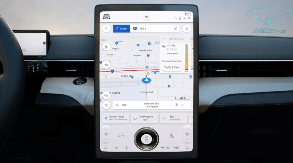
The Mustang Mach-E launched to much acclaim and is generally regarded as a success. There were several constraints that we had to manage to best support the interactions of the driver and passengers, from package and hardware decisions to support the importance of an exterior silhouette, to corporate decisions to be like Tesla, to a comparatively short timeline for the program – all of which had pros and cons. Perhaps my favorite critique of the Mustang Mach-E was in a comparison to Tesla’s Model Y, done by BBC’s Top Gear, in January 2021:
“If you like your tech on the bleeding edge and your furniture minimal, the Y is your choice. But if you just want to drive an electric car that keeps you safe and doesn’t try to dazzle you, the Mach-E is on point. It’s the less demanding, easier to interact with car.”
This critique is a favorite of mine because it coincides with the next seismic event in formulating my point of view on how to provide a confident and rewarding in-vehicle user experience.
