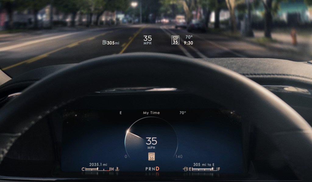
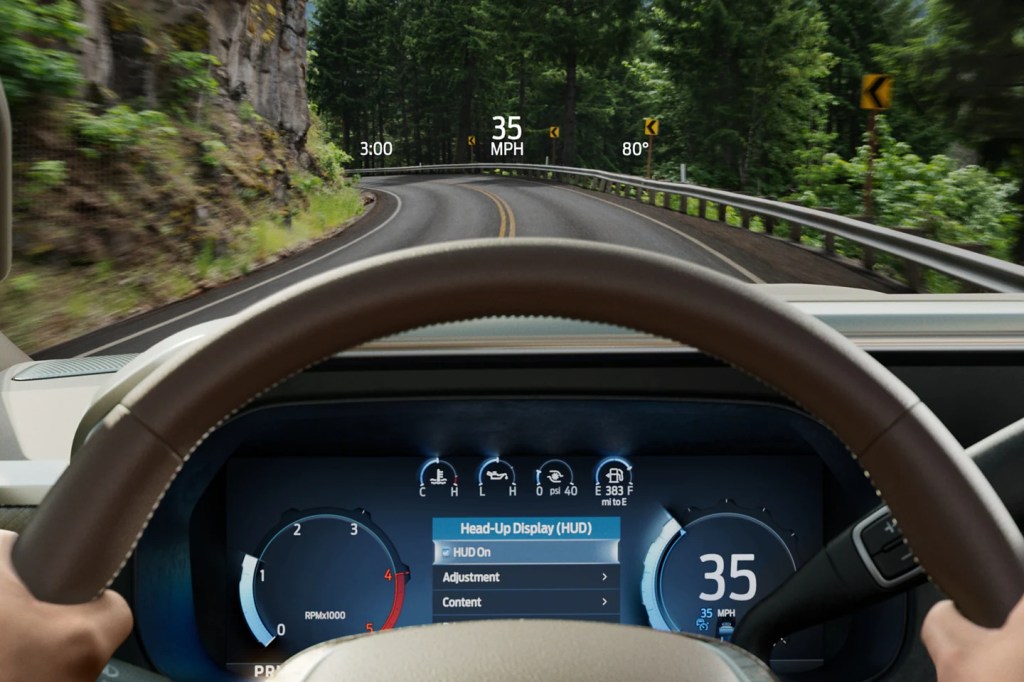
For many, driving is easy. However, as our drives have become more connected with the rest of our lives, so has the feeling that our attention is being taxed behind the wheel. A Head Up Display (HUD), as an example of Assisted Reality, offers an opportunity to display a limited amount of information to help a driver interpret their driving context in a location that makes it easy to inform. However, that same location makes it just as easy to distract, so there needs to be a considerate filter for what content makes it into a HUD. At a fundamental level, the HUD must support the driver’s sense of confidence and in so doing, support the sense of security for the passengers on board.
HUD designs often go wrong when they are designed like an instrument cluster – commonly done in the name of consistency. As Emerson said: “A foolish consistency is the hobgoblin of little minds…” and not recognizing the fundamental difference between an instrument cluster and a HUD is where the foolishness sets root. In a cluster, which is a closed-back display, the designer can prescribe the hierarchy of content. Conversely, a HUD is an open-backed display that is projected on the windshield of an automobile. It is open to the environment that the driver is tasked with managing and hurtling toward. Here, the environment is the star of the show, while the displayed content plays the role of a supporting actor – coming to the fore when the scene requires support and stepping back when none is needed. Acknowledging that the environment is the star is a key attribute of designing for a HUD to be a great HUD rather than designing a HUD to be a middling cluster. This means keeping persistent or status info as low or off to the side of the field of view as possible, not exaggerating the size of content to fill the space and not over-designing the assets to attract too much attention. It also means thinking about how to use the natural environment in the staging of content, which isn’t a skill used in cluster design. You sometimes see the deployment of content that was designed for an instrument cluster displayed in a HUD. An example of this might be the avatar of a vehicle providing a reference for information, such as the pitch and roll the vehicle. But this design presents an existential abstraction of one’s vehicle out in front of one’s vehicle. In this case, the result is over-designed content that missed the opportunity to leverage the horizon to deliver simplicity.
The approach that I developed for Lincoln’s Head Up Displays (and most recently, the 2023 Ford Super Duty) is:
- Keep most things quiet, clear, and out of the way
- Simplify, by being responsive to the view of the environment, where possible
- Leave yourself some room at the center of the stage to invite the driver’s attention, when needed
It is a less-pushy means of supporting the relationship.